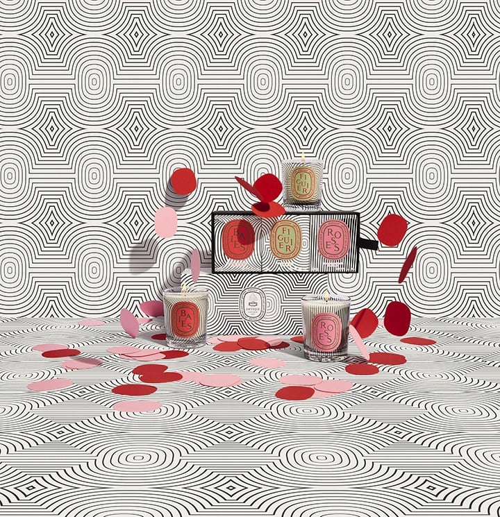
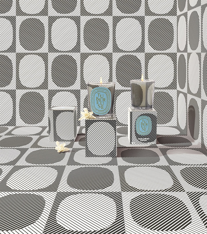
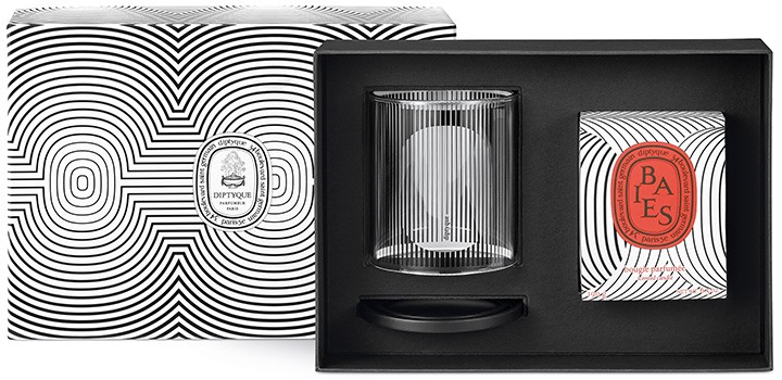
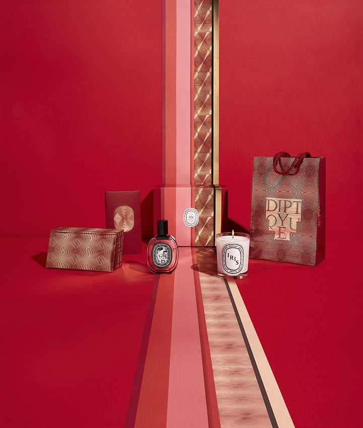
For the first chapter of its 60th anniversary celebration, diptyque is revisiting the history of the Maison and paying tribute to its graphic heritage through a joyful and participatory limited edition collection. Available now at diptyque Bal Harbour Shops, on Level 3.
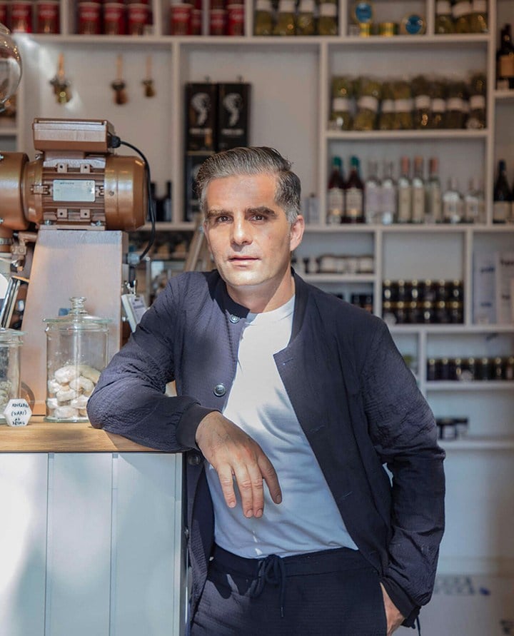
Yorgo Tloupas.
 What are your preferred instruments when designing a logo?
I always start on my Smythson notebook, with a variety of pens, but inevitably I switch to the magical tool that is Adobe Illustrator, a fantastic piece of software that enables even the clumsiest of all of us, like me, to create geometric perfection.
What are your preferred instruments when designing a logo?
I always start on my Smythson notebook, with a variety of pens, but inevitably I switch to the magical tool that is Adobe Illustrator, a fantastic piece of software that enables even the clumsiest of all of us, like me, to create geometric perfection.
 Which artists do you feel most akin to, or have been most inspired by?
My father Philolaos, was a renowned sculptor and designer, and I grew up in a house that he designed and built, where almost every piece of furniture came from his hands. I’d be lying if I pretended that I wasn’t inspired by this. Today I design chairs, tables and bottles for my house and office, very much like he did in the 60s and 70s.
Which artists do you feel most akin to, or have been most inspired by?
My father Philolaos, was a renowned sculptor and designer, and I grew up in a house that he designed and built, where almost every piece of furniture came from his hands. I’d be lying if I pretended that I wasn’t inspired by this. Today I design chairs, tables and bottles for my house and office, very much like he did in the 60s and 70s.
 What are your top five all-time favorite logo designs (and feel free to elaborate on why)?
The golden era of logo design basically happened before the advent of the personal computer, when craftsmanship was king, and skills required to draw geometric shapes with perfection, but there is a current renewal of talent that bodes well. My list if was to draw one would be:
What are your top five all-time favorite logo designs (and feel free to elaborate on why)?
The golden era of logo design basically happened before the advent of the personal computer, when craftsmanship was king, and skills required to draw geometric shapes with perfection, but there is a current renewal of talent that bodes well. My list if was to draw one would be:
- AT&T by Saul bass in 1983, where the globe looks like it’s drawn with shadows and gradients, but is in fact purely sharp and monochromatic.
- NBC by Chermayeff & Geismar in 1986, where the peacock only exists thanks to the minuscule detail of its beak in couter-shape. The animated version is a masterpiece as well.
- Mitsubishi has a logo that has barely changed since the late 19th century, and the 1953 symbol, composed of three identical lozenges evocative of the family shields of the founders, hasn’t changed an inch since then.
- Habitat introduced a symbol in 2002, made by GTF in London, which summarizes what the brand brings to the customers: love your home, and bring love to your home.
- The 1972 Renault logo by the artist Vazarely, a stroke of genius in its monochromatic geometrical impossibility.
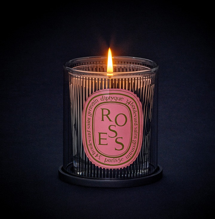 Do you have a favorite diptyque scent?
My favorite is Feu De Bois, ironically, I didn’t design graphics for this one… Hint at diptyque with multiple blinks for a potential new collaboration!
Browse this limited edition collection and more at diptyque Bal Harbour Shops, on Level 3.
Do you have a favorite diptyque scent?
My favorite is Feu De Bois, ironically, I didn’t design graphics for this one… Hint at diptyque with multiple blinks for a potential new collaboration!
Browse this limited edition collection and more at diptyque Bal Harbour Shops, on Level 3.


Leave a Comment